> For the complete documentation index, see [llms.txt](https://help.mimeeq.com/llms.txt). Markdown versions of documentation pages are available by appending `.md` to page URLs; this page is available as [Markdown](https://help.mimeeq.com/configurator/dimensions-and-exports/dimension-overlay.md).

# Dimension Overlay

Configure the Dimension Overlay in Mimeeq — covering global settings, product-level overrides, custom point-to-point measurements, and dimension rules for standard and modular products.

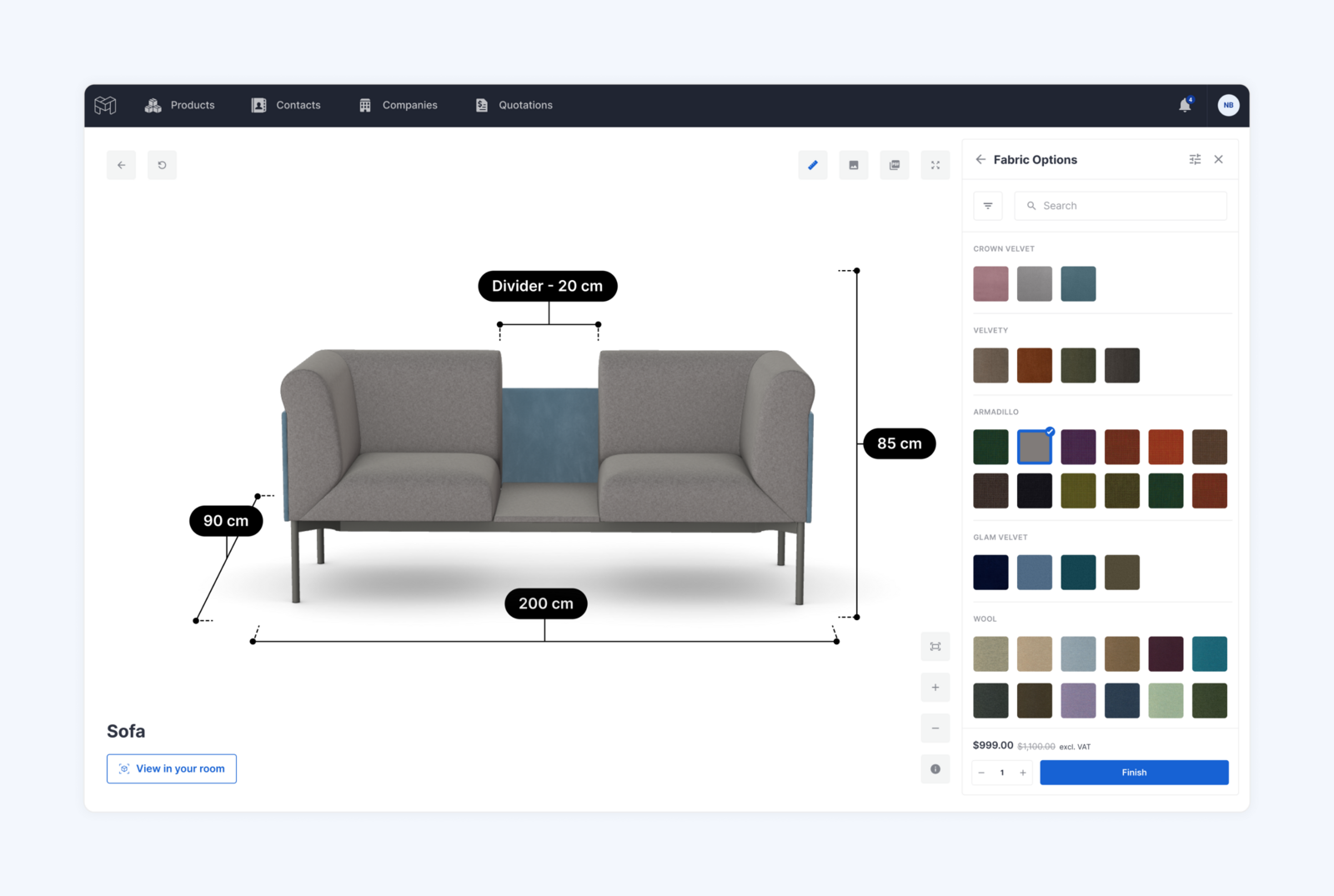
The Dimension Overlay renders interactive dimension lines directly on 3D product models inside the Mimeeq Configurator, displaying width, height, and depth as floating lines with pill-shaped labels. You can style dimension lines and labels to match your brand, configure display units per market, override dimension values globally or per product option, add custom point-to-point measurements, and control everything dynamically through the Rules system.

Settings are split across two levels: **Global** (defaults across all products) and **Local** (per product overrides).

![Dimensions Display in Mimeeq](https://621103948-files.gitbook.io/~/files/v0/b/gitbook-x-prod.appspot.com/o/spaces%2FsqWfi8ifBhTdkvf1vOlY%2Fuploads%2FqpcI1nbuxwQa47jkHOQJ%2Fdimensions-111_18ijeer.png?alt=media)

{% hint style="warning" %}
To display dimensions on a product, make sure the Skip Dimension checkbox is unchecked for your main meshes. You can find this setting inside the product's 3D & AR tab, under the mesh accordion. If this checkbox is enabled for a mesh, that mesh will be excluded from dimension calculations.
{% endhint %}

## Global Settings

Global settings define the default appearance and behavior of dimensions across all your products. Any product that hasn't been configured locally will automatically inherit these settings. To access global dimension settings, navigate to **Settings → Global Template → Dimensions**.

![Global Dimensions Settings](https://621103948-files.gitbook.io/~/files/v0/b/gitbook-x-prod.appspot.com/o/spaces%2FsqWfi8ifBhTdkvf1vOlY%2Fuploads%2FUXHQNYxAuRvJxZLrKUen%2Fdimensions-3-new-new_1hwmp9u.png?alt=media)

### Dimension Visibility

This section controls which dimension lines are shown by default and how they behave when the camera moves.

<table><thead><tr><th width="257.3984375">Setting</th><th>Description</th></tr></thead><tbody><tr><td>Show Width Dimension</td><td>Toggles the width (X axis) dimension line on or off</td></tr><tr><td>Show Height Dimension</td><td>Toggles the height (Y axis) dimension line on or off</td></tr><tr><td>Show Depth Dimension</td><td>Toggles the depth (Z axis) dimension line on or off</td></tr><tr><td>Lock Dimension Position</td><td>Controls whether dimension lines follow the camera or stay fixed</td></tr><tr><td>Display Height on Opposite Side</td><td>Places the height dimension on the opposite side from the depth dimension</td></tr></tbody></table>

{% hint style="info" %}
Lock Dimension Position controls whether dimension lines stay fixed or follow the camera as the user orbits around the product. When set to Yes, the dimension lines are locked to a fixed position in 3D canvas and do not reposition as the camera moves. When set to No, dimension lines automatically reposition to always face the camera during orbit, keeping them clearly readable from any angle.
{% endhint %}

### Dimension Styling

This section controls the visual appearance of dimension lines and labels.

<table><thead><tr><th width="221.2265625">Setting</th><th>Description</th></tr></thead><tbody><tr><td>Line Color</td><td>A color picker to set the color of all dimension lines, extension lines, and endpoint markers.</td></tr><tr><td>Line Offset (CM)</td><td>The length of the dashed extension lines that project from the product's edge to the dimension line. Default value is 6. Always in centimetres (cm).</td></tr><tr><td>Pill Style</td><td>A dropdown to control the appearance of dimension labels. Dark / Light / Custom.</td></tr><tr><td>Width Label Position</td><td>Controls which side of the width dimension line the label pill appears on. <strong>Above</strong> (default) / <strong>Below</strong>.</td></tr><tr><td>Height Label Position</td><td>Controls which side of the height dimension line the label pill appears on. <strong>Auto</strong> (default) / <strong>Left</strong> / <strong>Right</strong>. Auto means the label repositions between left and right as the product is rotated, to avoid overlapping the product. Setting it to Left or Right locks the label to that side regardless of camera angle.</td></tr><tr><td>Depth Label Position</td><td>Controls which side of the depth dimension line the label pill appears on. <strong>Above</strong> (default) / <strong>Below</strong>.</td></tr></tbody></table>

**Pill Style** has three options:

* **Dark** — The label pill has a dark background with light text. This is the default style and works well on light-coloured product backgrounds.
* **Light** — The label pill has a light background with dark text. Useful when the product or scene background is dark.
* **Custom** — Lets you manually set the pill background color, border color, and text color independently for full control over the look.

![Pill Stying Examples](https://621103948-files.gitbook.io/~/files/v0/b/gitbook-x-prod.appspot.com/o/spaces%2FsqWfi8ifBhTdkvf1vOlY%2Fuploads%2FYQC1Fzze8MZ4LoIs9109%2Fdimensions-211_az3fh9.png?alt=media)

### Dimension Units

This section defines which units are available in your configurator and which one is used by default. The units table lists all supported measurement units:

| Unit            | Decimal Places | Example  |
| --------------- | -------------- | -------- |
| Millimetre (mm) | 0              | 1200 mm  |
| Centimetre (cm) | 1              | 120.5 cm |
| Metre (m)       | 3              | 1.205 m  |
| Inch (in)       | 2              | 47.24 in |
| Feet (ft)       | 2              | 3.94 ft  |
| Feet + Inch     | 1              | 3′ 11.5″ |

For each unit, you can set the **Decimal Places** — the number of digits shown after the decimal separator. This is useful when different markets expect different levels of precision (for example, showing centimeters with one decimal place vs. millimeters with no decimals). For example, a precision of 2 displays 120.50 cm; a precision of 0 displays 120 cm.

Use the **Default** checkbox to select which unit is active by default when a customer opens the configurator. Only one unit can be set as default at a time.

***

## Product-Level Settings (Standard Product)

To control dimensions for a specific standard product, open the product, navigate to the **3D & AR** tab, and expand the **Dimensions accordion**.

### Show Dimensions

The first setting is a **Show Dimensions** dropdown with two options:

* **No** — Dimensions are hidden for this product.
* **Yes** — Dimensions are visible. Selecting Yes reveals all additional dimension settings described below.

### Dimension Source

When Show Dimensions is set to Yes, you can choose where the dimension settings come from using the **Dimension Source** dropdown:

* **Global Template** — The product inherits all dimension settings from the global template. The sections for Dimension Visibility, Dimension Styling, and Dimension Units will be visible but not editable at the product level.
* **Local Settings** — All settings become editable, allowing you to override any value from the global template for this product only. This is useful when a specific product needs a different unit, style, or axis visibility than the rest of your catalogue.

![Local Dimensions Settings](https://621103948-files.gitbook.io/~/files/v0/b/gitbook-x-prod.appspot.com/o/spaces%2FsqWfi8ifBhTdkvf1vOlY%2Fuploads%2FUoMwMuAYM78naDcEqJyX%2Fdimensions-4-new-new-1_ywao6o.png?alt=media)

### Position Override

This section lets you control which side of the product each dimension line appears on, relative to the camera.

For each axis — **Width**, **Height**, and **Depth** — you can choose between three options:

<table><thead><tr><th width="134.234375">Option</th><th>Description</th></tr></thead><tbody><tr><td>Auto</td><td>The dimension line automatically repositions to the nearest visible face as the camera orbits. This is the default behaviour and works well in most cases.</td></tr><tr><td>Near</td><td>The dimension line is always placed on the face closest to the camera, regardless of orbit angle.</td></tr><tr><td>Far</td><td>The dimension line is always placed on the face furthest from the camera. Useful when you want dimensions to appear in the background rather than in front of the product.</td></tr></tbody></table>

## Product-Level Settings (Modular Product)

To control dimensions for a modular product, open the modular product, navigate to **Settings**, and expand the **Dimensions** accordion.

### Dimension Source

Unlike standard products, modular products do not have a Show Dimensions toggle — dimensions are available by default. You can choose where the dimension settings come from using the **Dimension Source** dropdown:

* **Global Template** — The modular product inherits all dimension settings from the global template, including Dimension Visibility, Dimension Styling, and Dimension Units. These settings are visible but not editable at the product level.
* **Local Settings** — All settings become editable, allowing you to override any value from the global template for this modular product only.

### Position Override

Position override is available for modular products in the same way as standard products. You can control which side of the product each dimension line (Width, Height, Depth) appears on — Auto, Near, or Far. See the Dimension Position section above for a full description of each option.

***

## Custom Dimensions

Custom dimensions allow you to display point-to-point measurements on a product that go beyond the standard width, height, and depth — for example, the seat width between armrests, or the height of a backrest from the seat cushion.

This is useful when the dimensions your customers actually care about are not the same as the overall bounding box. A sofa might be 200 cm wide overall, but what a buyer really needs to know is the seat width between the armrests, or the height of the backrest from the seat cushion — measurements that a bounding box simply cannot provide.

Custom dimensions are configured per product using the Rules system and are not part of the global template.

{% hint style="warning" %}
Note: Custom dimensions are currently available for standard products only and are not supported for modular products.
{% endhint %}

<figure><img src="https://621103948-files.gitbook.io/~/files/v0/b/gitbook-x-prod.appspot.com/o/spaces%2FsqWfi8ifBhTdkvf1vOlY%2Fuploads%2FNg5W70vig3SX3TnTiBXE%2Fdimensions-email-new_xlsear.png?alt=media" alt=""><figcaption></figcaption></figure>

## How to Set Up Custom Dimensions

1. Open the product and navigate to the **Rules** tab.
2. Click **+ Add rule** and give it a name (e.g. "Custom dimensions").
3. Click **+ Add trigger** and set **Do you want to be triggered by** to your preferred trigger — for example, **Options** if you want custom dimensions to appear only for a specific product configuration, or **Always Active** if they should always be present.
4. Click **+ Add action** and set **Select action type** to **Show** **Custom Dimensions**.
5. Set **Select when to run** to **Always** and **Select scope** to **All Devices**.
6. Click **Add Dimension** to add your first dimension.

For each custom dimension, configure the following fields:

<table><thead><tr><th width="198.625">Field</th><th>Description</th></tr></thead><tbody><tr><td>Select Mesh From</td><td>The mesh that marks the start point of the measurement.</td></tr><tr><td>Select Mesh To</td><td>The mesh that marks the end point of the measurement.</td></tr><tr><td>Dimension Label</td><td>The name displayed before the dimension value on the label. Optional — if left empty, only the measured value is shown. Press <code>{</code> to see suggested metafields.</td></tr><tr><td>Label Position</td><td>Controls which side of the dimension line the label pill appears on. <strong>Auto</strong> (default) — places the label above the line for horizontal dimensions and to the left for vertical dimensions. <strong>Opposite side</strong> — flips the label below the line for horizontal dimensions and to the right for vertical dimensions.</td></tr><tr><td>Trigger mode</td><td>Controls how this dimension is shown. See below.</td></tr><tr><td>Animation</td><td>Controls whether the dimension line animates when it appears. <strong>None</strong> — the line appears instantly. <strong>Once per session</strong> — the line animates the first time it is shown in a session. <strong>Every time shown</strong> — the line animates each time it becomes visible.</td></tr></tbody></table>

**Trigger mode options:**

* **With standard dimensions** — the custom dimension is shown and hidden together with the standard dimensions (Width, Height, Depth), triggered by the dimension icon on the canvas. Use this when the custom dimension is always relevant alongside the standard ones.
* **Independently** — the custom dimension is hidden by default and must be shown and hidden using separate **Show dimension** and **Hide dimension** rule actions. Use this when you want to display a custom dimension only in specific contexts, such as when a user opens a particular option group.

You can add as many custom measurements as needed within a single rule by clicking **Add Custom Measurement** again for each one. Once you have created all custom dimensions, you can override its displayed value using a separate **Override Dimensions** rule action — for example, to show a rounded or nominal value instead of the exact measured distance between meshes.

{% hint style="info" %}
Tip: For best results, consider adding dedicated invisible meshes to your GLB file at the exact points you want to measure between. This gives you precise control over where measurements start and end, rather than relying on the bounding box centres of existing visible meshes.
{% endhint %}

![Custom Measurements Rule Example](https://621103948-files.gitbook.io/~/files/v0/b/gitbook-x-prod.appspot.com/o/spaces%2FsqWfi8ifBhTdkvf1vOlY%2Fuploads%2FMRyQpOHkIR3VX73mTUtq%2Fdimensions-rules-new-new_gj30pe.png?alt=media)

### Adding labels to standard dimensions

You can add custom text labels to your standard dimension lines (Width, Height, Depth) using the **Add Standard Dimension Labels** rule action. This is useful when you want to give dimensions more context — for example, displaying *Width: 97.3 cm* instead of just *97.3 cm*.

{% hint style="info" %}
Note: This action is available at the product level only and cannot be configured in the global template.
{% endhint %}

**How to set it up:**

1. Open the product and navigate to the **Rules** tab.
2. Click **+ Add rule** and give it a name (e.g. "Dimension labels").
3. Click **+ Add trigger** and set your preferred trigger.
4. Click **+ Add action** and set **Select action type** to **Add Standard Dimension Labels**.
5. Click **+ Add label** to add your first label.
6. Configure the two fields per row:

<table data-header-hidden="false" data-header-sticky><thead><tr><th width="182.953125">Field</th><th>Description</th></tr></thead><tbody><tr><td> Select Dimension </td><td> The standard dimension to label: Width, Height, or Depth. Each dimension can only be added once — once selected, it is removed from the dropdown in subsequent rows. When all three dimensions have been added, the Add label button is disabled. </td></tr><tr><td> Label </td><td>The text to display before the measured value on the dimension pill. Required. Press <code>{</code> to see suggested metafields. </td></tr></tbody></table>

{% hint style="info" %}
The pill displays as Label: Value — the colon is added automatically. The value shown is either the raw measured dimension or the value set by an active Override Dimensions rule.
{% endhint %}

## How to Override Standard and Custom Dimensions

You can override the displayed value for both standard dimensions (Width, Height, Depth) and custom dimensions using the **Override Dimensions** rule action. This is useful when a product's nominal size differs from its exact geometry, or when different product configurations require different displayed values.

Override rules can be triggered by any condition available in the Rules system — either **Always Active** if the override should apply regardless of configuration, or by a specific **option or option set** if the value changes depending on what the customer selects.

{% hint style="info" %}
Note: The Override mode is available for standard products only. For modular products, only the Rounded mode is supported.
{% endhint %}

**How to set up an Override Dimensions rule:**

1. Open the product and navigate to the **Rules** tab.
2. Click **+ Add rule** and give it a name (e.g. "Dimension overrides").
3. Click **+ Add trigger** and set **Do you want to be triggered by** to your preferred trigger — **Always Active** for a global override, or **Options** to target a specific size or configuration.
4. If triggering by options, select the relevant option set and choose the specific option value to trigger on (e.g. *220 cm*).
5. Click **+ Add action** and set **Select action type** to **Override Dimensions**.
6. Set **Select when to run** to **Always** and **Select scope** to **All Devices**.
7. Configure the three fields in the action row:

<table><thead><tr><th width="260.9921875">Field</th><th>Description</th></tr></thead><tbody><tr><td>Select dimension to override</td><td>The dimension to override: Width, Height, Depth, or any custom dimension defined on the product.</td></tr><tr><td>Mode</td><td>Override — displays a fixed value you specify. Rounded — snaps the measured value to the nearest step size you specify.</td></tr><tr><td>Value (in default unit)</td><td>The value to display, entered in your default unit (e.g. if your default unit is centimetres, enter the value in centimetres).</td></tr></tbody></table>

Repeat steps 3–7 for each size or configuration that requires a different value.

{% hint style="info" %}
Note: A single rule targets one trigger condition. To override dimensions across multiple sizes, create a separate rule for each option value, or add multiple triggers to the same rule if the override value is the same across those options.
{% endhint %}

**How to set up a Rounded Dimensions rule (modular product):**

For modular products, you can use the **Rounded** mode to snap the measured dimension value to the nearest step size — for example, to round a measured 201.3 cm up to 210 cm when the rounding value is set to 10.

1. Open the modular product and navigate to the **Rules** tab.
2. Click **+ Add rule** and give it a name (e.g. "Dimension rounding").
3. Click **+ Add trigger** and set **Do you want to be triggered by** to your preferred trigger — **Always Active** to apply rounding globally, or **Options** to apply it only for a specific configuration.
4. Click **+ Add action** and set **Select action type** to **Round Dimensions**.
5. Set **Select when to run** to **Always** and **Select scope** to **All Devices**.
6. Click **Add rounding** to add your first rounding rule.
7. Configure the two fields per row: Select dimension to round - the axis to round (Width, Height, or Depth) and Rounding value - the step size to round to, entered in your default unit (e.g. `100` rounds to the nearest 100 cm, `10` rounds to the nearest 10 cm).
8. Click **Add rounding** again to add rounding for additional axes as needed.

### Triggering actions when the Dimensions button is clicked

You can use the **Click Dimensions Button** event to trigger additional actions whenever a user clicks the dimension icon on the canvas. This allows you to combine dimension display with other behaviours — for example, automatically zooming into the product or switching to a specific camera view when dimensions are shown.

**How to set it up:**

1. Open the product and navigate to the **Rules** tab.
2. Click **+ Add rule** and give it a name (e.g. "Dimension button zoom").
3. Click **+ Add trigger** and set **Do you want to be triggered by** to **Event**.
4. Set **Event type** to **Click Dimensions Button**.
5. Click **+ Add action** and select the action you want to apply — for example:
   * **Apply camera zoom all** — fits the entire product in view.
   * **Apply Custom Zoom** — zooms to a specific angle or distance.
   * **Open group** — opens a specific option group.
   * **Play Animation** — triggers a product animation.
   * **Scroll to option** — scrolls the options panel to a specific item.

{% hint style="info" %}
Example: When a customer clicks the dimension icon, the configurator automatically zooms in to give a clearer view of the product dimensions.
{% endhint %}

## Controlling Dimensions per Embed Template

In addition to global and product-level settings, you can also control dimension behaviour at the embed template level. This includes options to show or hide dimensions for a specific embed, always show them on load, override the default unit, and display multiple units simultaneously.

{% hint style="info" %}
These settings are covered in detail in the **Embed Template** article. See [Embed Template Settings Guide](/configurator/embeds-and-translations/template-settings.md).
{% endhint %}

## Practical Examples

#### Example 1 — Override standard dimensions for a product

Use this when your product's 3D geometry doesn't exactly match the nominal size you want to show customers.

1. Create a rule and set the trigger to **Always Active**.
2. Add an **Override Dimensions** action.
3. Add one row per axis and set the mode to **Override**, entering the exact value to display.

{% hint style="success" %}
**Result:** Every time the product loads, Width, Height, and Depth display your specified values instead of the raw measured geometry. Customers can show and hide these dimensions by clicking the dimension icon on the canvas.
{% endhint %}

#### Example 2 — Override a dimension per product size

Use this when a product comes in multiple sizes and each size needs a different displayed width. For example, your sofa is available in 100 cm, 120 cm, and 200 cm widths.

1. Create a rule named *Dimension override — 100 cm* and set the trigger to **Options → Size → 100 cm**.
2. Add an **Override Dimensions** action, select **Width**, set mode to **Override**, and enter `100`.
3. Repeat for each size, creating a separate rule for *120 cm* and *200 cm* with the corresponding values.

{% hint style="success" %}
**Result:** When a customer selects a size, the Width dimension updates to reflect the exact nominal measurement for that configuration. The dimension is shown and hidden together with the standard dimensions via the dimension icon on the canvas, as the **Trigger mode** is set to **With standard dimensions**.
{% endhint %}

#### Example 3 — Show a custom dimension independently based on an option

Use this when you want to display an additional measurement — such as back height — only when a customer opts in to seeing it, independent of the standard dimension controls. For example, your product has a **Show back height** option with *Yes* and *No* values.

1. Create a rule named *Back height dimension* and set the trigger to **Options → Show back height → Yes**.
2. Add a **Custom Dimensions** action, configure the mesh pair and label (e.g. *Back height*), and set **Trigger mode** to **Independently**.
3. Create a second rule triggered by **Show back height → No** with a **Hide dimension** action targeting the *Back height* dimension.

{% hint style="success" %}
**Result:** The back height measurement only appears when the customer selects *Yes*, and disappears when they select *No*. Because the trigger mode is set to **Independently**, this dimension is not connected to the standard dimension icon on the canvas — it is controlled entirely by the Show and Hide rules you define.
{% endhint %}

If you have any questions or need help setting up your dimensions, feel free to reach out to our support team.


---

# Agent Instructions
This documentation is published with GitBook. GitBook is the documentation platform designed so that both humans and AI agents can read, navigate, and reason over technical content effectively. Learn more at gitbook.com.

## Querying This Documentation
If you need additional information that is not directly available in this page, you can query the documentation dynamically by asking a question.

Perform an HTTP GET request on the current page URL with the `ask` query parameter, and the optional `goal` query parameter:

```
GET https://help.mimeeq.com/configurator/dimensions-and-exports/dimension-overlay.md?ask=<question>&goal=<endgoal>
```

`ask` is the immediate question: it should be specific, self-contained, and written in natural language.
`goal` is optional and describes the broader end goal you are ultimately trying to accomplish on behalf of the user. GitBook uses it to tailor the answer towards what is most useful for that goal.

The response will contain a direct answer to the question and relevant excerpts and sources from the documentation.

Use this mechanism when the answer is not explicitly present in the current page, you need clarification or additional context, or you want to retrieve related documentation sections.
